
Every painting begins with color, but for beginners, mixing paints often feels like a riddle with too many answers. Why does red and blue sometimes yield a luminous violet, and at other times, only a dull brown? How do artists prevent their palettes from collapsing into a uniform gray mass?
The key lies in understanding color theory, distinguishing between light and pigment mixing, and approaching the palette with both restraint and curiosity. This guide introduces the foundations of mixing—primary, secondary, and tertiary colors—explains additive versus subtractive mixing, and walks step-by-step through palette organization, practical mixing methods, and strategies for avoiding the dreaded “mud.”
1. Primary, Secondary, and Tertiary Colors

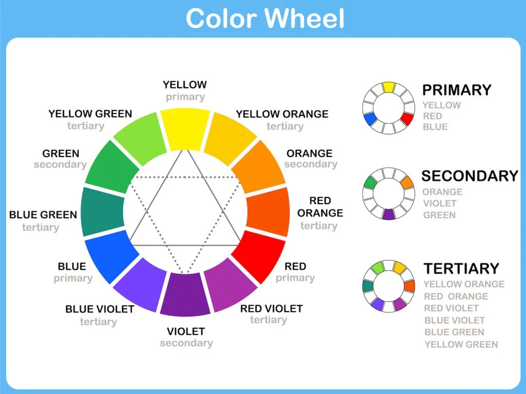
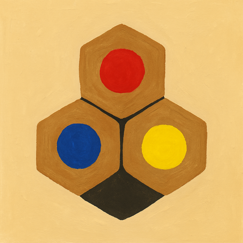
The language of color begins with the primaries. In traditional art instruction, red, yellow, and blue (RYB) are treated as the building blocks of pigment mixing. These three are called primaries because they cannot be created from other colors, yet together they generate a broad range of hues (Janson 56).
- Red: associated with energy, blood, and fire.
- Yellow: linked to light, warmth, and harvest.
- Blue: cool, vast, and oceanic.
Mixing primaries produces secondary colors: red and yellow make orange; yellow and blue yield green; blue and red form purple. These combinations, familiar to every schoolchild with a watercolor set, are the first discoveries of color’s transformative potential.
Beyond these lie the tertiary colors—mixtures of a primary with its neighboring secondary, such as red-orange, blue-green, or yellow-green. Tertiaries expand the palette into subtle gradations, the very hues that lend naturalism to foliage, flesh, or the atmosphere of twilight.
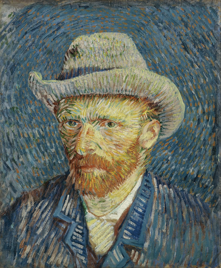
Historically, artists relied on these intermediate tones to convey light’s instability. Vincent van Gogh, for example, often juxtaposed complementary pairs like red and green to intensify their brilliance. In Self-Portrait with Grey Felt Hat (1887), the brushstrokes of green surrounding his head are sharpened by their contrast with the reds and oranges of his face, producing a vibration that seems almost luminous (Mateják 21).
2. Additive vs. Subtractive Mixing
It is essential to distinguish between the mixing of light and the mixing of pigment.
Additive Mixing (Light)
Additive mixing governs light itself: theater spotlights, digital screens, photography. Its primaries are red, green, and blue (RGB). When combined at full intensity, these yield white light. A television screen, examined under magnification, reveals clusters of red, green, and blue pixels—together, they create the illusion of every color.
Subtractive Mixing (Pigments)
Painters, however, work subtractively. Pigments absorb certain wavelengths of light and reflect others. The subtractive primaries are cyan, magenta, and yellow (CMY), or the traditional RYB. As more pigments are combined, more light is absorbed, and the result trends toward darker, more neutral colors (Mateják 18–19).
This explains the beginner’s frustration: pigments behave differently from the luminous colors of a digital palette. An image of a sunset glows on the computer screen through additive light. On canvas, the same colors, mixed subtractively, often appear muted. Artists must therefore simulate the brilliance of light using pigments that inherently darken when combined.
3. Setting Up a Palette
A well-organized palette is the first safeguard against confusion. Begin with a limited selection of paints:
- Titanium White
- Cadmium Red or Alizarin Crimson (for a cooler red)
- Ultramarine Blue
- Cadmium Yellow or Lemon Yellow (for a cooler yellow)
- Burnt Sienna or Raw Umber (to control saturation and neutralize mixtures)
Arrange the colors consistently, usually from warm to cool, and reserve a central area for mixing. Between mixtures, clean brushes thoroughly. Residual paint is one of the most common sources of unintentional dullness.
4. Methods of Mixing
Direct Mixing
The simplest method is to combine paints directly on the palette with a brush or knife. This produces predictable swatches but risks dullness if too many pigments are involved.
Optical Mixing (Layering and Glazing)
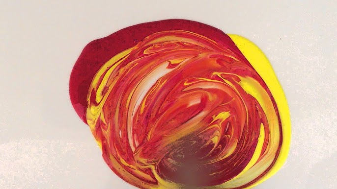
Old Masters frequently relied on optical mixing. A thin layer of transparent paint—glaze—was applied over a dry layer of another hue. For instance, glazing yellow over blue yields a luminous green distinct from directly mixing the two. The light penetrates the surface layer, reflects from the lower one, and the viewer’s eye unites them into a single vibrant impression.
Scumbling and Broken Color
The Impressionists pioneered broken color: dabbing small strokes of complementary hues side by side so that they blended in the viewer’s eye rather than on the palette. The method produces vibration and energy, the sensation of light in motion.
5. Avoiding Muddy Colors
The nemesis of every beginner is “mud”—the dull, gray-brown that results when mixtures cancel one another out. To avoid it:
- Limit the number of pigments. Mix two at most. Each added pigment brings additional light absorption, accelerating dullness.
- Be cautious with complements. While red and green, or blue and orange, can produce rich neutrals, they also risk deadening vibrancy.
- Maintain clean tools. Even a trace of leftover paint on a brush can tip a mixture toward undesired tones.
- Test on scrap. Before committing a mixture to canvas, make small swatches.
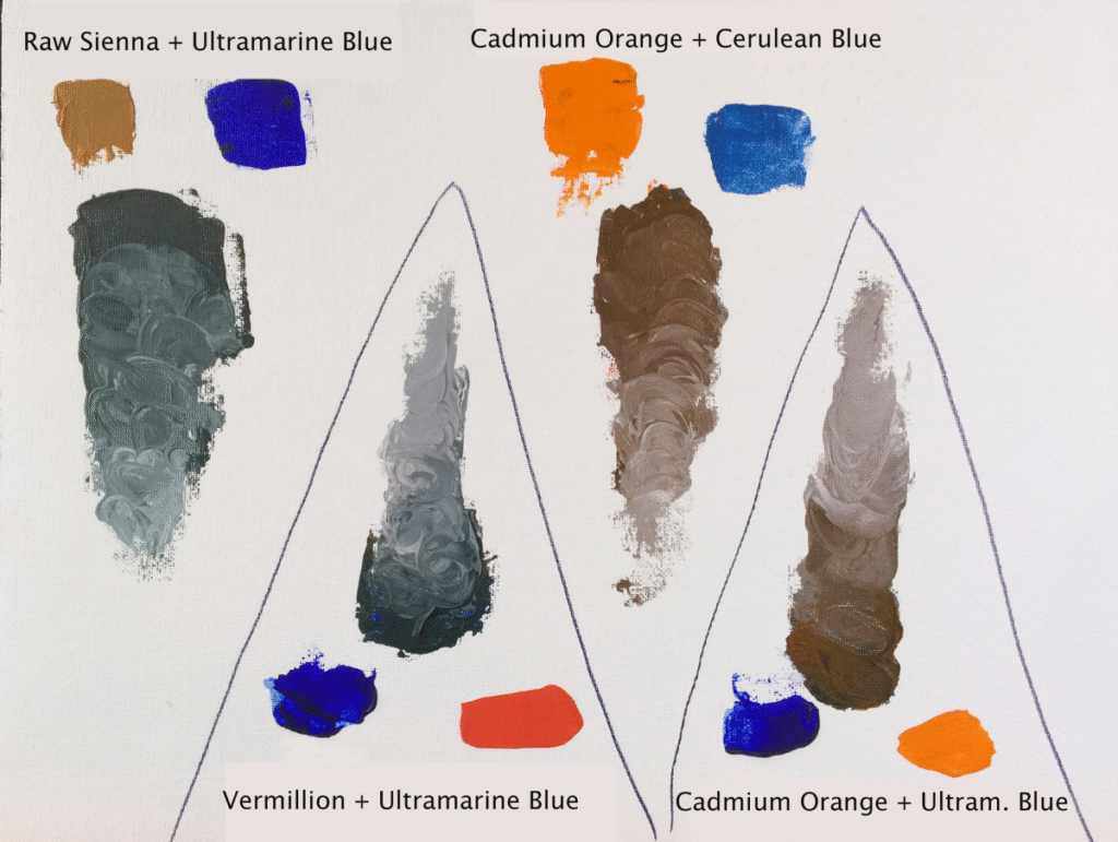
Yet it is important to note that mud is not inherently negative. Rembrandt’s portraits, for example, rely on complex browns and muted neutrals to convey shadow, depth, and atmosphere (Schneider 144). The problem arises only when the painter produces such tones unintentionally.
6. Step-by-Step: Creating a Mixing Chart
A practical exercise is to create a color chart:
- Draw a grid on watercolor paper or canvas board.
- Across the top row, place your primaries plus white and one neutral.
- Repeat the same sequence down the first column.
- Fill each square by mixing the intersecting pair.
- Red + Yellow = Orange
- Yellow + Blue = Green
- Blue + Red = Purple
- Record the ratios (e.g., two parts yellow, one part blue).
This simple chart becomes a personal reference, a record of how your chosen pigments behave. Each brand, each tube, will yield slightly different results. The chart preserves discoveries that might otherwise vanish with the rinse water.
Conclusion
Mixing colors is both scientific and poetic. The logic of primaries and secondaries provides a structure; the physics of additive and subtractive mixing explains why screens and paints diverge. But practice—organizing a palette, layering paints, creating charts—turns theory into habit.
As Johann Wolfgang von Goethe wrote, “Color itself is a degree of darkness” (qtd. in Mateják 14). To mix colors is to wrestle with that paradox: to coax light out of matter, to make brilliance from shadow. Mastery lies not in memorizing formulas but in learning, again and again, how pigments behave under the hand.
Works Cited
Janson, H. W., and Anthony F. Janson. History of Art. 4th ed., Harry N. Abrams, 1991.
Mateják, Jan. Color Mixing Essentials: A Contemporary Beginner’s Guide to Color Theory and Color Mixing. MATE ART, 2022.
Schneider, Norbert. The Art of the Portrait: Masterpieces of European Portrait Painting 1420–1670. Taschen, 2002.