
You ever buy a sketchbook that looks gorgeous on the outside, only to find the paper inside feels like it was stolen from a hotel notepad? Yeah, that’s paper betrayal. The truth is, sketchbooks aren’t just bound stacks of white rectangles — they’re engineered surfaces with personalities. Some will love your pencils, others will eat your ink alive, and a few will crumple in protest the moment you touch them with water.
That’s where three big scary words come in: tooth, sizing, weight. They sound like items on a medieval barber-surgeon’s menu, but they’re actually the secret handshake to understanding sketchbook paper. Crack these three, and you’ll never again waste money on a sketchbook that ghosts your lines or buckles under a wash.
Tooth: The Paper’s Personality Disorder
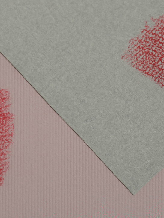
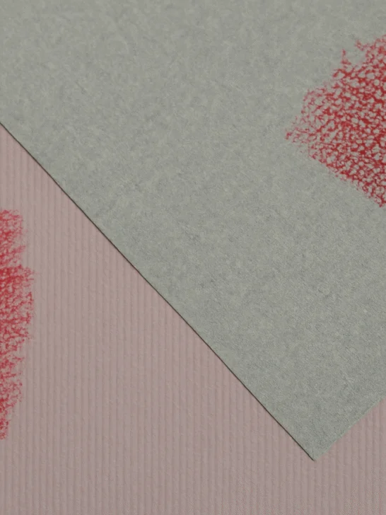
“Tooth” is just the fancy word for paper texture — the little hills and valleys that either welcome your pencil like an old friend or chew your pen nib into oblivion. Run your fingers across a page: if it’s smooth like glass, that’s fine tooth. If it feels like a cat’s tongue, that’s rough tooth.

- Fine tooth: Smooth operators. Best for pencil sketches, ink lines, and anything that needs precision. The downside? They don’t hold onto much graphite or charcoal, so forget about dramatic, layered shading — your lines will skate on the surface like they’re late for work.
- Medium tooth: The sketchbook equivalent of a diplomatic middle child. It grips enough graphite to let you shade, but still smooth enough to keep ink from bleeding into fuzz. This is the “safe bet” sketchbook for artists who dabble in everything.
- Rough tooth: Drama queens. These pages are textured enough to grab every particle of charcoal, pastel, or conte crayon and refuse to let go. Great for bold, expressive work. Awful for delicate ink lines — your pen strokes will look like they were dragged across gravel.
Here’s the kicker: tooth isn’t just about feel, it’s about how the paper interacts with your medium. Smooth paper lets ink dry crisp, but graphite tends to smear. Rough paper builds rich, layered tones but makes detail work a fight. That’s why pros often keep multiple sketchbooks — one for crisp pen studies, another for gritty charcoal explosions.
Think of tooth as Tinder for your tools. Charcoal wants texture, ink craves smoothness, pencil likes to keep its options open. Swipe right carefully.
Weight: Because Paper Hits the Gym
Those cryptic numbers on the back of sketchbooks — 90gsm, 120gsm, 200gsm — aren’t there to look impressive. They’re the paper’s weight class, literally how much a square meter of the stuff weighs. The bigger the number, the thicker and tougher the sheet. Think of it as your paper’s muscle mass.
- 90–100gsm: The Featherweights
Smooth talkers but weaklings. Good for light pencil doodles, quick notes, and dry media experiments. But throw ink or marker at it and you’ll get bleed-through faster than gossip in a WhatsApp group. Turn the page and your drawing is haunting the back like a ghost. - 120–160gsm: The Middleweights
The everyday champions. They’re sturdy enough for confident sketching, light ink work, and the occasional marker test. They can even take a very light watercolor wash if you’re gentle. This is the paper most sketchbook addicts actually use day-to-day — strong enough to fight back, but not so thick it makes your book look like a brick. - 200gsm+: The Heavyweights
The beasts. You can pour watercolor, gouache, even diluted acrylics, and the paper will just grunt and hold its ground. No buckling, no crying, no bleed-through. Perfect for mixed media warriors who like to slap, scrub, and layer their way into chaos. Just don’t expect to carry too many sheets in one book — these pages are chunky.
Rule of thumb: if you can see your hand through the sheet, it’s lightweight paper masquerading as “all-purpose.” If it feels like card stock, it’s heavyweight and ready for abuse.
Why it matters: Paper weight decides whether your sketch survives an eraser, a wash, or a heavy graphite attack. Go too light and you’re drawing on tissue paper. Go too heavy and your “portable sketchbook” turns into arm day at the gym.
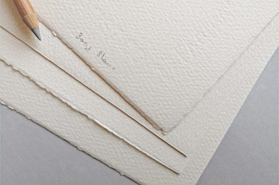
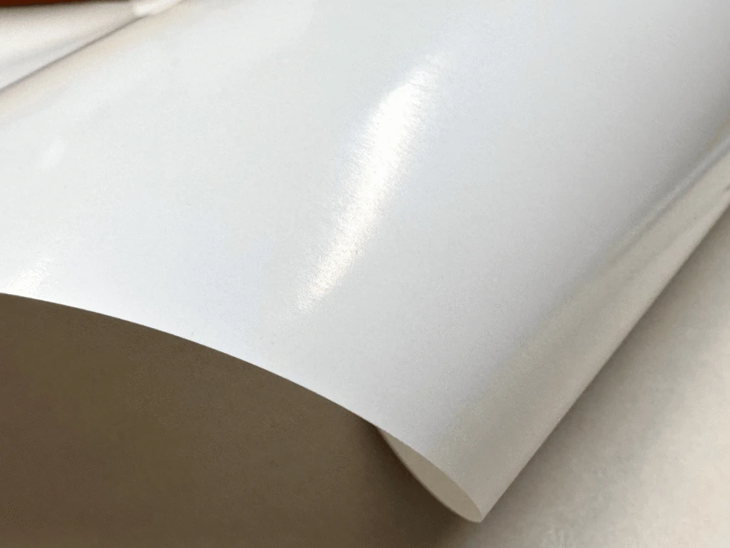
Sizing: The Invisible Force Field
Here’s the thing: paper isn’t naturally noble. Left untreated, it’s just pressed fibers that drink water like a hangover cure. That’s why artists invented sizing — an invisible shield that keeps your paper from acting like a sponge at a pool party.

There are two main flavors of this force field:
- Internal sizing: Mixed right into the pulp during papermaking. This is the default defense system — it makes paper behave respectably with pencils, pens, and light ink. Without it, your carefully inked line would feather into a fuzzy mess. Think of internal sizing as the paper’s basic manners.
- Surface sizing: Painted, dipped, or rolled onto the paper’s skin after it’s formed. This is the heavy artillery, and watercolor paper brags about it like a gym bro about his protein intake. Surface sizing slows down absorption so pigment hangs out on the surface long enough for those dreamy gradients and crisp brushstrokes.
Now, unsized paper? That’s chaos incarnate. Touch it with a wet brush and it buckles, bleeds, and melts into pulp faster than your willpower on payday. It’s fine for newsprint sketches, not so fine for anything involving water.
Why you care:
- Love watercolors? You need strong surface sizing.
- Just sketching with pencil or biro? Internal sizing is enough.
- Into mixed media? Look for paper that brags about both.
Sizing is the reason one sketchbook handles ink washes like a champ while another folds like a cheap umbrella. It’s invisible, unglamorous, but absolutely decisive.
Sketchbook Paper Types Explained
Not all sketchbook paper is born equal. Walk into an art store and you’ll face a small library of options with names that sound like secret societies: Cartridge, Bristol, Vellum. Each has its own quirks, and choosing the right one is the difference between smooth sailing and sketching regret. Here’s the cheat sheet:

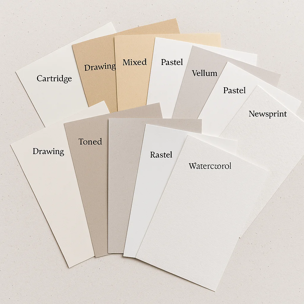
- Cartridge Paper
The workhorse of sketchbooks. Usually medium weight (120–150gsm) with a slight tooth. Great for pencil, charcoal, and ink, and tough enough to handle a light wash without falling apart. - Sketch Paper
Lightweight (around 90gsm). Perfect for quick doodles and warmups, but don’t expect it to take ink or water well. Think of it as the paper equivalent of scratch notes. - Drawing Paper
A step up from sketch paper. Heavier, with more tooth, making it friendly for detailed pencil work, charcoal, or pastel. It’s the “serious sibling” of the cheap sketchpad. - Mixed Media Paper
The Swiss Army knife. Designed to handle both wet and dry media, usually 160–250gsm. If you’re indecisive — one day pencil, next day watercolor splashes — this paper won’t complain. - Toned Paper
Comes in shades like gray, tan, or mid-brown. Gives you a middle ground so you can build up highlights and shadows with equal drama. Popular for figure studies and portraits. - Bristol Board
Ultra-smooth, heavyweight paper (often 250gsm+). Ink lines look razor sharp, markers blend beautifully. If you’re into comics, illustration, or crisp line work, Bristol is king. - Vellum
Traditionally calfskin, but in paper form it means a slightly translucent sheet with a smooth, velvety surface. Great for pen, pencil, and architectural drafting. - Pastel Paper
Extra toothy, almost sandpaper-like. It grabs pastel dust and holds it. Comes in a variety of colors so you can build light and dark values on top. - Newsprint
Cheap, thin, and not archival. Best for gesture drawing, warmups, and practice sessions where you’ll burn through dozens of pages. It yellows fast, but that’s fine — it’s disposable. - Watercolor Paper
Thick, heavily sized, usually 200gsm or more. Designed to take washes, glazes, and abuse from brushes. Comes in hot press (smooth), cold press (textured), and rough varieties.
Bottom line: the “right” paper isn’t about prestige; it’s about what you plan to throw at it. Match the medium to the surface, and your sketchbook becomes an ally instead of an enemy.
So, Which Sketchbook Do You Actually Need?
- Pencil-only doodles?
Grab a fine-tooth sketchbook around 90–100gsm. Smooth enough for clean lines, cheap enough that you won’t cry if you abandon it after three pages (which you will). - Ink & markers?
Look for medium-tooth, 120–160gsm with decent internal sizing. It’ll keep your ink lines crisp without bleeding, and your markers won’t ghost through like bad secrets. - Mixed media warrior?
If you’re splashing watercolor, gouache, or ink washes, you need 200gsm+ heavyweight with strong surface sizing. This is the paper equivalent of a battlefield tank. Yes, your sketchbook will get heavy, but so will your flex. - Charcoal & soft pastels?
Only rough-tooth will love you back. Your fingertips will hate you, your erasers will die young, but the grit will hold every dusty particle in place.
Next Reads You’ll Love
- Why Hands and Feet Are the Hardest to Draw (and How to Master Them) – once you’ve got the right paper, test it with the toughest anatomy challenge.
- Mastering the Basics of Perspective Drawing: 15 Quick Tips for Beginners – because perspective plus good paper = sketches that don’t collapse in on themselves.
- Best Pencils for Drawing and Shading – match your sketchbook to the right graphite arsenal.
- The Best Sketchbooks for Artists (In-Depth Reviews and Buying Guide) – if you’re now itching to shop smarter, here’s your companion guide.
Final Scribble
Here’s the truth the art stores don’t tell you: no single sketchbook does it all. That’s why artists hoard them like dragons with gold, piling towers of half-used books in studio corners. Each sketchbook is a different weapon — the trick is matching the paper to the medium so it doesn’t betray you mid-sketch.
So next time you’re seduced by a leather-bound beauty or a discount bin special, flip it over. Check the tooth, sizing, and weight. Because your sketchbook isn’t just paper — it’s the arena where your ideas fight to exist. Pick the wrong one, and the paper wins. Pick the right one, and it becomes invisible, letting your art do all the talking.